How to Create YouTube Video Thumbnails: Best Practices and Solutions
⏱ Reading Time: 11 min.
📅 Posted on: June 13th, 2024
Creating eye-catching YouTube thumbnails is essential for grabbing viewers' attention and boosting your video's click-through rate. Thumbnails serve as the first impression of your content, and a well-designed one can make the difference between someone clicking on your video or scrolling past it.

We'll explore the key elements that make a thumbnail stand out and provide practical tips to help you design thumbnails that attract more viewers. Whether you're a seasoned creator or just starting, mastering thumbnail creation is a game-changer for your channel's growth.
Key Takeaways
Significance of Thumbnails: High-quality YouTube thumbnails significantly impact viewer engagement and click-through rates, serving as the first impression of your video content.
Optimal Design Practices: Consistent use of colors, fonts, and branding elements reinforces channel identity and improves viewer recognition and retention.
Technical Specifications: Thumbnails should be designed with a resolution of 1280x720 pixels, using supported file formats (JPG, PNG, GIF) and staying under the 2MB size limit.
Effective Imagery: Selecting high-resolution images with clear focal points and using faces or expressive visuals can increase thumbnail efficacy.
Font and Text Usage: Employ readable font sizes (at least 40 points) and utilize contrasting colors to make text stand out without overwhelming the overall design.
Templates and Uploading: Utilizing pre-designed templates and following proper uploading steps can streamline the creation process, ensuring consistency and professionalism.
Importance of YouTube Video Thumbnails
The importance of YouTube video thumbnails cannot be understated. Thumbnails serve as the face of your video content and can dramatically influence viewer engagement.
Why Do Thumbnails Matter?
Thumbnails act as the first impression for potential viewers. Effective thumbnails can make your content stand out in a sea of videos by capturing attention quickly. A well-designed thumbnail communicates the subject of your video, enticing users to click and watch. On the other hand, a poorly designed thumbnail may result in users scrolling past your content without a second glance.
Alsti video title and thumbnail are usually all the information that viewers get when selecting which video to watch next. And that's important both when users find your video via the search bar or on their suggested videos page.

Impact on Video Views and Engagement
High-quality thumbnails directly affect video views and engagement rates. According to YouTube's Creator Academy, compelling thumbnails can increase click-through rates by up to 64%. The thumbnail is a decisive factor in whether or not viewers choose to engage with your video over others. Higher engagement rates lead to better visibility on the platform, further boosting the potential for your content to be discovered. Therefore, investing effort in creating eye-catching thumbnails can be a significant driver of channel growth.
Consistent use of engaging thumbnails could lead to a loyal audience base, as it sets a visual brand identity. This, in turn, helps in retaining viewers while attracting new ones, contributing to the sustained success of your YouTube channel.
Materials Needed
Creating YouTube video thumbnails requires specific materials to achieve professional and engaging results. Use the following subheadings to gather the necessary tools.
Photo Editing Software
Advanced editing tools ensure high-quality thumbnails. Adobe Photoshop and GIMP are popular choices that offer comprehensive features. Use software that supports layers, text designs, and image enhancements. Free options like Canva also provide templates tailored for YouTube thumbnails. Ensure the software can export images in high resolution to maintain thumbnail clarity.
Images and Graphics
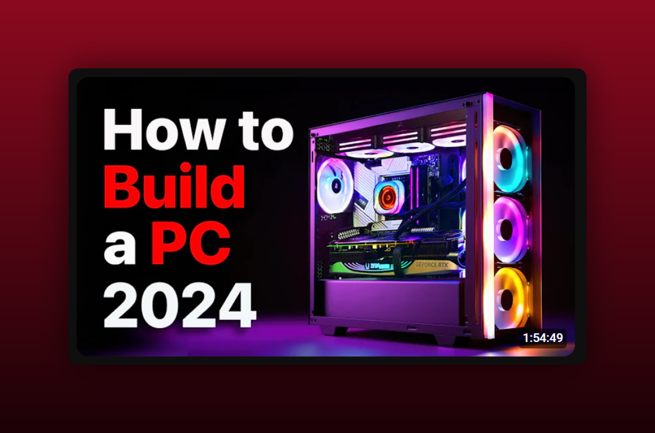
High-quality visuals capture viewers' attention. Source images and graphics from royalty-free websites like Unsplash and Pixabay. Original photos or frames from your video also enhance thumbnail relevance. Use vector graphics for scalable icons and logos. Incorporate engaging and bright visuals to stand out in search results and recommendations. Opt for images with a clear focal point to convey the video's subject effectively.
Understanding YouTube Thumbnail Dimensions and Requirements
Accurate dimensions and correct file formats ensure that our thumbnails appear professional and engaging, meeting YouTube's technical standards.
Standard Thumbnail Dimensions
Thumbnails on YouTube should use a resolution of 1280x720 pixels, with a minimum width of 640 pixels. Larger thumbnails appear better across various devices and screen sizes, maintaining clarity and visual impact. Keeping the aspect ratio at 16:9 ensures compatibility with YouTube's player and preview systems. Always design thumbnails at the highest resolution possible to avoid blurriness when displayed on larger screens.
File Size and Format
The maximum file size for YouTube thumbnails is 2MB. Keeping file sizes below this threshold avoids upload issues and ensures quick loading times. Formats supported by YouTube include JPG, GIF, BMP, and PNG. Among these, JPG and PNG are most common due to their balance of quality and file size. Using PNG often results in higher quality but larger files, while JPG provides a good balance between quality and storage efficiency.
Designing Your Thumbnail
Choosing the Right Image
Selecting the right image for your YouTube thumbnail is crucial for capturing viewer interest. High-quality images that directly represent the content of your video generally perform better. We recommend using high-resolution images that are clear, concise, and engaging.
Find Strong Visuals: Ensure the image has a clear focal point. Avoid cluttered backgrounds and choose visuals that draw attention. Images should effectively convey the video's subject matter at a glance.
Utilize Unique Stills: Consider using high-quality stills from the video itself. This provides consistency and accurately represents the content.
Royalty-Free Sources: If original images aren't available, use high-quality images from royalty-free sources. Websites like Unsplash or Pexels offer a range of options.
Consistency in style helps build your brand. Always keep your audience in mind when choosing imagery for your thumbnails.
Optimizing Font and Text for Thumbnails
Proper font and text choices enhance thumbnail appeal and readability, crucial for attracting viewers.
Selecting Font Size
Choosing the right font size ensures that text remains readable even in smaller versions of thumbnails. For optimal clarity, use a font size of at least 40 points.

This size accommodates various screen types, including mobile devices. Titles or key phrases should be in larger fonts for emphasis while avoiding overwhelming the thumbnail. Smaller text can supplement but shouldn't be the focal point.
Effective Use of Space
Effective space utilization prevents cluttered thumbnails and highlights key information. Place text strategically around key visual elements without obstructing them.

Consider using contrasting colors for text and background to enhance readability. Align text with visual hierarchy principles; important text should be immediately visible. Use different font weights to differentiate primary and secondary information. Ensure there's enough padding around text to maintain a clean appearance.
Incorporating Branding Elements
Including branding elements in YouTube video thumbnails help to reinforce our channel identity and increases recognition among viewers. Effective branding elements create a cohesive experience.
Use Consistent Colors
Selecting consistent colors is essential. Incorporate the same color palette used in our channel art and video outro.

For example, if our channel theme uses shades of blue and white, these colors should appear in each thumbnail. Consistent use of colors helps viewers instantly recognize our content.
Add Channel Logo
Adding our channel logo to every thumbnail enhances brand recognition. Place the logo in a consistent position, ensuring it is visible but not overshadowing the main content.

Typically, placing the logo in a corner works well to subtly reinforce branding.
Utilize Custom Fonts
Using custom fonts that match our brand identity reinforces the overall look. Select fonts used in our video titles, intros, or outros. Custom fonts should be legible and avoid overly complex designs. Clear fonts help maintain consistency and professionalism.
Just be aware, you need an easy-to-read font, especially an easy-to-read font when seen as just part of a thumbnail on 1/3 of your phone screen (that's how we typically see thumbnails). There's a reason why most channels use just a handful of fonts all across YouTube.
Include a Unique Element
Incorporating a unique element that represents our brand, such as a specific graphic or icon, establishes a distinguishable look. Examples include a particular shape or pattern consistently used across all thumbnails. This unique element contributes to creating a visual signature for our channel.
Highlight Recognizable Faces
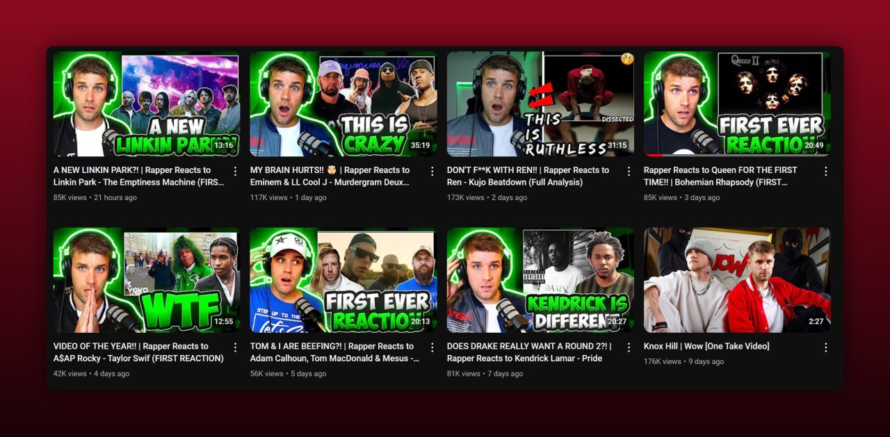
Featuring recognizable faces from our videos can be an effective branding strategy. Consistently using the faces of hosts or recurring characters helps build a connection with viewers. Ensure the images are clear and expressive to attract attention.

Ensure High-Quality Design
Maintaining high-quality design standards in every thumbnail is crucial. Use high-resolution images, clean lines, and balanced compositions to enhance the visual appeal. Avoid clutter and focus on clear, sharp visuals to uphold our brand's quality.
Best Practices for Thumbnail Creation
To create engaging YouTube video thumbnails, consider the following best practices.
Consistency in Design
Maintain a uniform style across all thumbnails for brand recognition. Use consistent fonts, colors, and visual themes. Align text and graphics similarly in each thumbnail to ensure a cohesive look within the channel. Consistency helps viewers identify your content quickly, reinforcing your brand identity.
Using Faces and Eye Contact
Include clear images of faces in thumbnails for a stronger viewer connection.

Faces with direct eye contact can draw attention and engage viewers. For instance, close-ups of presenters or people relevant to the video topic tend to perform better. Human expressions can make the content feel relatable and trustworthy.
Highlighting Emotion or Action
Emphasize emotions or actions to grab the viewer's attention. Use thumbnails that show expressive reactions or dynamic movements. Examples include a person showing surprise, excitement, or demonstrating a key action from the video. Highlighting these elements makes the thumbnail compelling and indicative of the video content’s energy.
By adhering to these best practices, our thumbnails can become more effective in attracting and retaining viewers. Focus on consistency, relatable faces, and dynamic emotions or actions to enhance engagement.
How to Use Templates for Quick Thumbnails
Using templates significantly speeds up the thumbnail creation process. Templates provide pre-designed layouts that can be easily customized to fit the content and aesthetic of the YouTube channel, ensuring consistency.
Finding Templates
A variety of websites offer downloadable templates specifically designed for YouTube thumbnails. Popular sites like Canva, Adobe Spark, and Snappa provide free and premium templates. These platforms allow users to search for templates by category, ensuring the design matches the video’s content. For example, Canva’s library includes template categories like travel, cooking, and gaming that can be filtered to find the most appropriate design.
Customizing Templates
Once a suitable template is found, personalization enhances its effectiveness. Adjust colors to align with the channel’s branding, ensuring consistency across videos. Replace placeholder images with high-quality, relevant images or stills from the video. Add text that highlights key points or the video title, using custom fonts to match the brand’s style. Incorporating unique elements, such as logos or specific icons, further reinforces the consistency and recognizability of the brand.
By following these steps, the template customization process becomes seamless and efficient, resulting in compelling YouTube thumbnails ready to attract more viewers.
Uploading Your Thumbnail to YouTube
Enhance your video's visual appeal by uploading a custom thumbnail. Follow the steps below to ensure a smooth process.
Steps to Upload
Sign in to YouTube Studio: Access the YouTube Studio from your account to get started.
Select Content: Choose 'Content' from the left-hand menu to find your video list.
Click on the Video: Select the video to which you want to upload the thumbnail.
Upload Thumbnail: In the 'Thumbnail' section, click 'Upload Thumbnail' and select your prepared image.
Save Changes: After uploading, click 'Save' to apply the thumbnail to your video.
Image Format: Ensure your thumbnail is in a supported format like JPEG, PNG, or GIF.
File Size: The thumbnail must be under 2MB. Compress your image if necessary.
Resolution: Use a minimum resolution of 1280x720 pixels for optimal display.
Account Verification: Verify your account if prompted; only verified accounts can upload custom thumbnails.
By following these guidance points, we maintain consistency and brand visibility.
Common Issues and Solutions
While creating YouTube video thumbnails, several common problems arise that can impact viewer engagement. Let's discuss these issues and their solutions to ensure thumbnails attract viewers effectively.
Problems with Image Clarity
Blurry or low-resolution thumbnails fail to attract clicks. Ensure the image resolution is at least 1280 x 720 pixels, with a minimum width of 640 pixels. Check that the image is clear and free of noise. Use high-quality images at optimal resolution to prevent pixelation. Adapt images to fit both large and small screen sizes without losing clarity.
Issues with Thumbnail Not Showing
Sometimes, custom thumbnails do not appear after uploading. Confirm that the account is verified and enabled for custom thumbnails. Check that the image format is PNG, JPG, or GIF and the file size is under 2MB. Ensure that the image complies with YouTube's Community Guidelines. If the issue persists, refresh the upload page or try a different browser.
Thus, addressing image clarity and thumbnail visibility ensures that the visual elements of YouTube videos work effectively to engage the audience.
Conclusion
Creating effective YouTube video thumbnails is essential for capturing viewer attention and driving engagement. By focusing on high-quality images proper dimensions and optimized fonts we can ensure our thumbnails stand out. Utilizing templates from platforms like Canva and Adobe Spark streamlines the process while maintaining consistency.
Let's not overlook common pitfalls such as image clarity and visibility. By maintaining image resolution and verifying our account we can avoid these issues and keep our branding strong. With these strategies in place our thumbnails will not only attract viewers but also enhance our overall channel presence.
Frequently Asked Questions
Why are YouTube video thumbnails important?
YouTube video thumbnails are crucial because they visually attract viewers and give a preview of the content. A captivating thumbnail can significantly increase click-through rates, thus enhancing viewer engagement and boosting channel growth.
What dimensions should I use for YouTube thumbnails?
The recommended dimensions for YouTube thumbnails are 1280 x 720 pixels, with a minimum width of 640 pixels. This ensures that thumbnails appear clear and optimal across all devices.
How can I improve the clarity of my YouTube thumbnails?
To improve thumbnail clarity, use high-quality images and ensure the resolution is adequate. Opt for image files in JPEG or PNG formats and avoid excessive compression that can lead to blurriness.
Where can I create efficient YouTube thumbnail templates?
You can create efficient YouTube thumbnail templates using platforms like Canva, Adobe Spark, and Snappa. These tools offer pre-designed templates and customization options to help you create professional-looking thumbnails quickly.
How can I make sure my thumbnails are visible?
Ensure your YouTube thumbnails are visible by maintaining appropriate file sizes, adhering to YouTube’s dimension guidelines, and verifying your account. Consistent use of branding elements also helps in making your thumbnails recognizable.
What should I do if my YouTube thumbnails are blurry?
If your YouTube thumbnails are blurry, check the resolution to ensure it meets the 1280 x 720 pixels recommendation. Also, use a high-quality image file (JPEG or PNG) and avoid too much compression.
How do I solve issues with thumbnails not showing on my videos?
If thumbnails aren’t showing, verify your YouTube account and ensure the file size is under 2MB. Follow YouTube’s recommended resolution and format guidelines, and avoid any policy violations that may cause visibility issues.
